
Colours are evocative. They have a great impact on how we relate to, and experience, things that we see. For this reason, clients are careful with the colours they choose for their weddings, events and gifts. Whether you’d like to create a feeling of nostalgia, love, peace, inspiration or excitement, colour will play a large part, and you’ll want it to be just right. I’ll make sure that it is.
Having studied colour theory, and particularly the CMYK approach to colour mixing, I’m able to mix ink to match pretty much any colour you wish. Whether you’d like your place cards to match your bridesmaids’ dresses, or your wedding vows to be calligraphed in your bride or groom’s favourite colour, I apply colour theory principles to mix just the right hue for you.
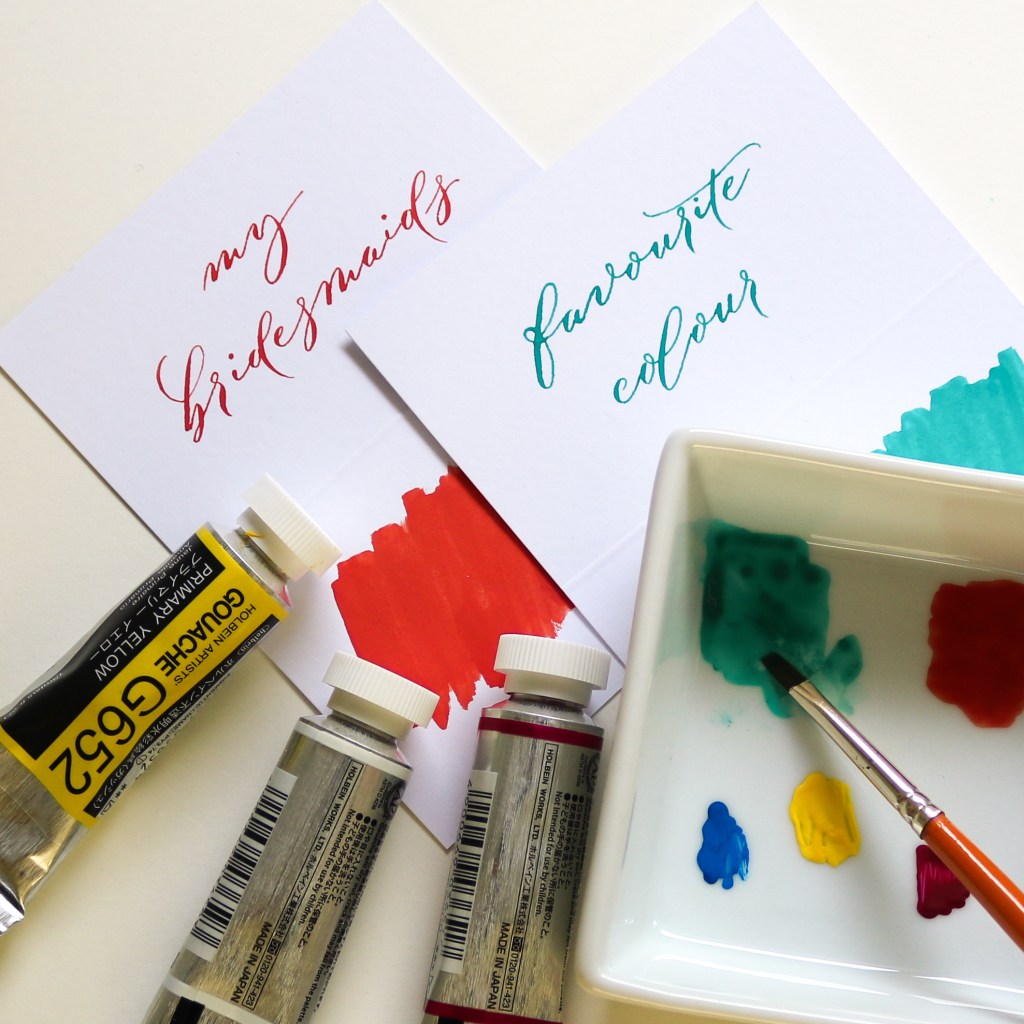
Started in 1906 and standardised in the 1940s, the CMYK approach to colour mixing is considered to be the best colour system for producing more accurate and vivid colours in a wide range of hues. For this reason, it is the colour system used by printers worldwide, and the one that enables me to produce an accurate colour match for you. I use only the highest quality, lightfast, highly pigmented, non-toxic gouache, ensuring the truest mix of colour and the best finish on paper.
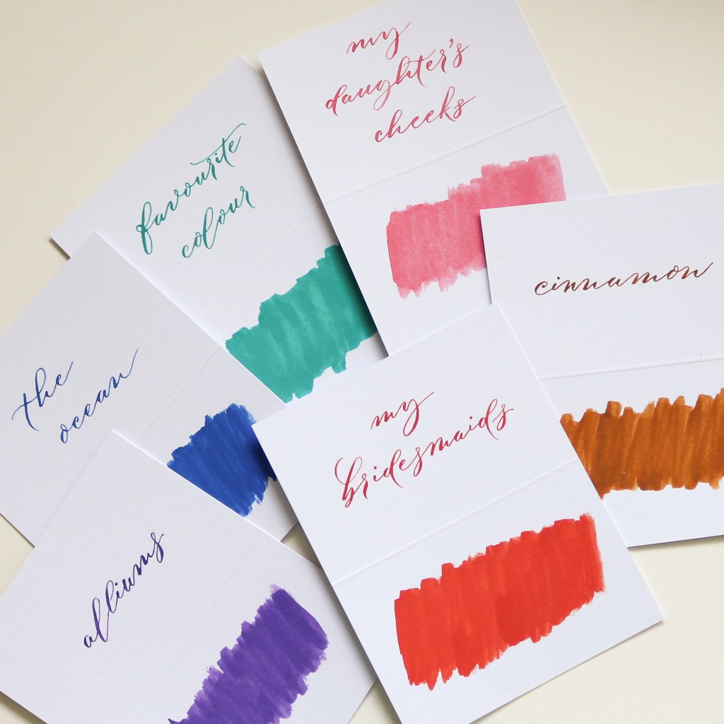
If you have a colour in mind and you’re wondering whether it’s possible to match it (it probably is!), please get in touch. I love to experiment with colour. I’ve colour matched many of my favourite things, some swatches of which you’ll see here, from cinnamon to my daughter’s cheeks! It’s great fun so don’t be afraid to ask for something specific.
You can send me a digital colour sample by email (perhaps a photograph) or a swatch through the post and I’ll be happy to match to that. Alternatively, if you have an RGB or Pantone formula, I can translate those too.
I look forward to your colour-matching challenge!
